FIA Formula E
Typeface design
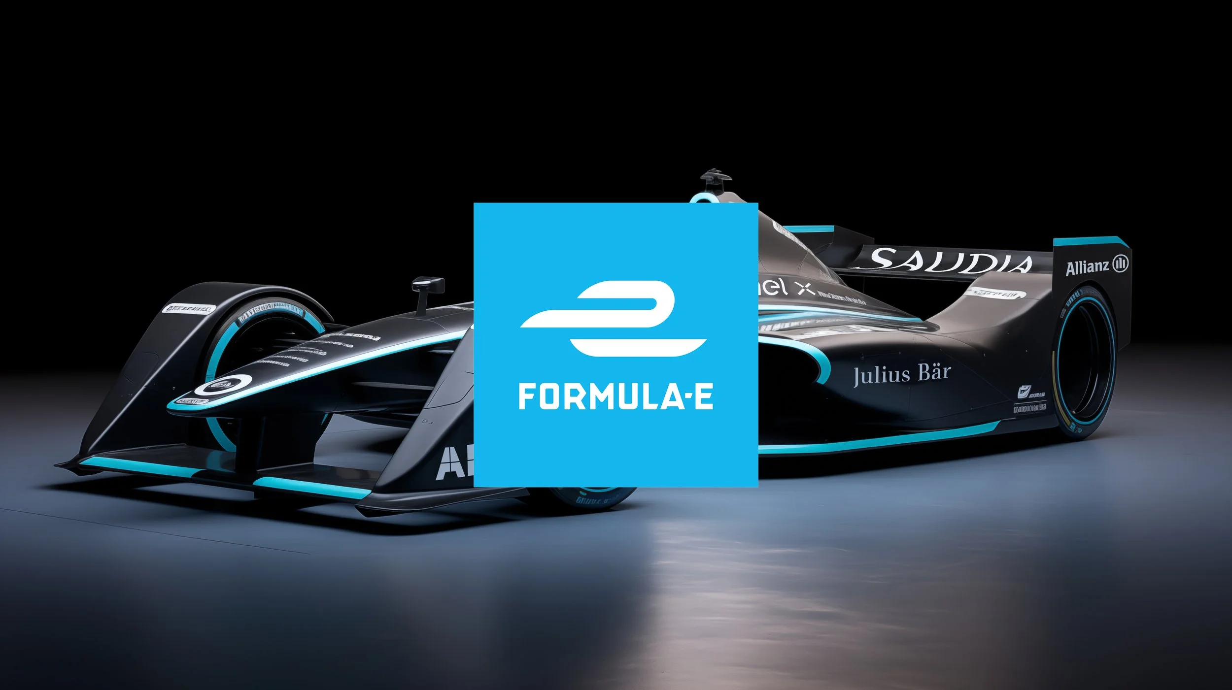
At Yarza Twins, we had the incredible opportunity to create an exclusive typeface for FIA Formula E, the groundbreaking Electric Street Racing Series. Formula E stands at the forefront of motorsport, pushing the boundaries of what sport represents. They blend entertainment, sustainability, technology, and innovation, setting themselves apart from Formula 1 with their commitment to combating climate change and promoting electric vehicles as a solution to urban air pollution.
What sets Formula E apart is their mission to make electric vehicles accessible, breaking down barriers within the EV market. We are immensely proud to support a sport with such a forward-thinking and eco-conscious vision.
The typeface we designed for Formula E not only pays homage to their innovative ethos but also breaks away from the traditional norms of sports branding. Our inspiration came from early 20th-century industrial and maritime fonts, reminiscent of the 1910s to 1930s in the USA and Europe. We drew inspiration from a 1928 travel poster advertising sea voyages between Rotterdam and London by Wm. H. Müller & Co’s Batavier Line. This aesthetic can be found in various posters, ships, and advertising of that era.
Central to this typography is the distinct pointed 'R,' a feature that ignited our creativity to reimagine this style with a modern twist. Formula E, aligned with their pioneering values, aimed to set their brand apart from other sports giants. They envisioned a minimalist and fresh brand with a keen eye on history, and we were honoured to help them bring this vision to life. The brand design was done by Dixon Baxi.
This rebrand was live until 2022.


