Neo2, breaking the Rules of Editorial Design
Mixing branding and editorial design
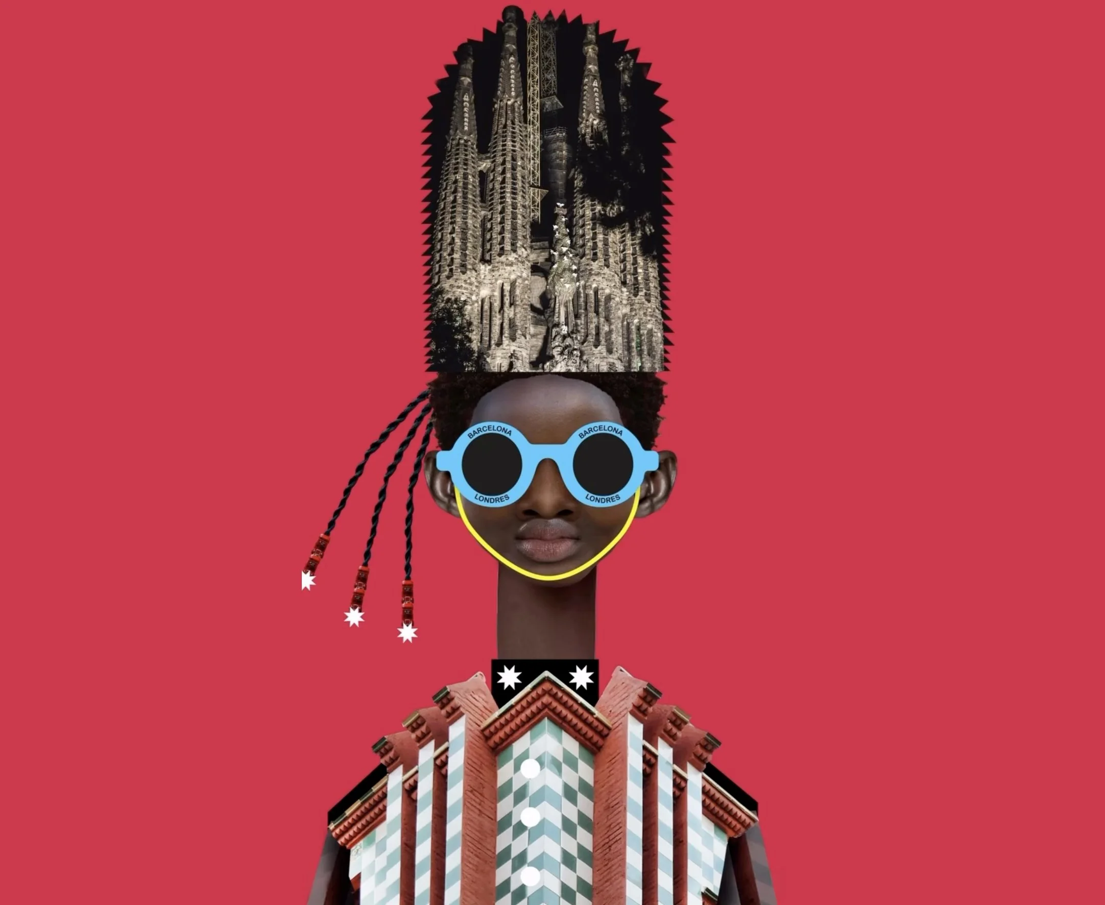
Creative freedom and the art of the unexpected
We were handed the keys to Neo2, one of Spain’s most iconic magazines for music, art, and design. Every year, they collaborate with a different studio to refresh their look, and they gave us something rare: total creative freedom. We didn't just want to "redesign" a magazine; we wanted to unleash a visual manifesto.
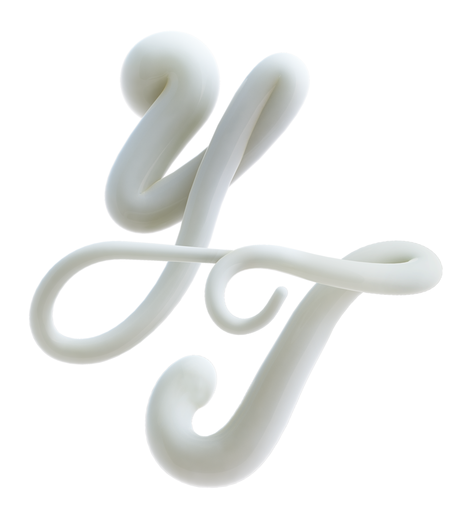
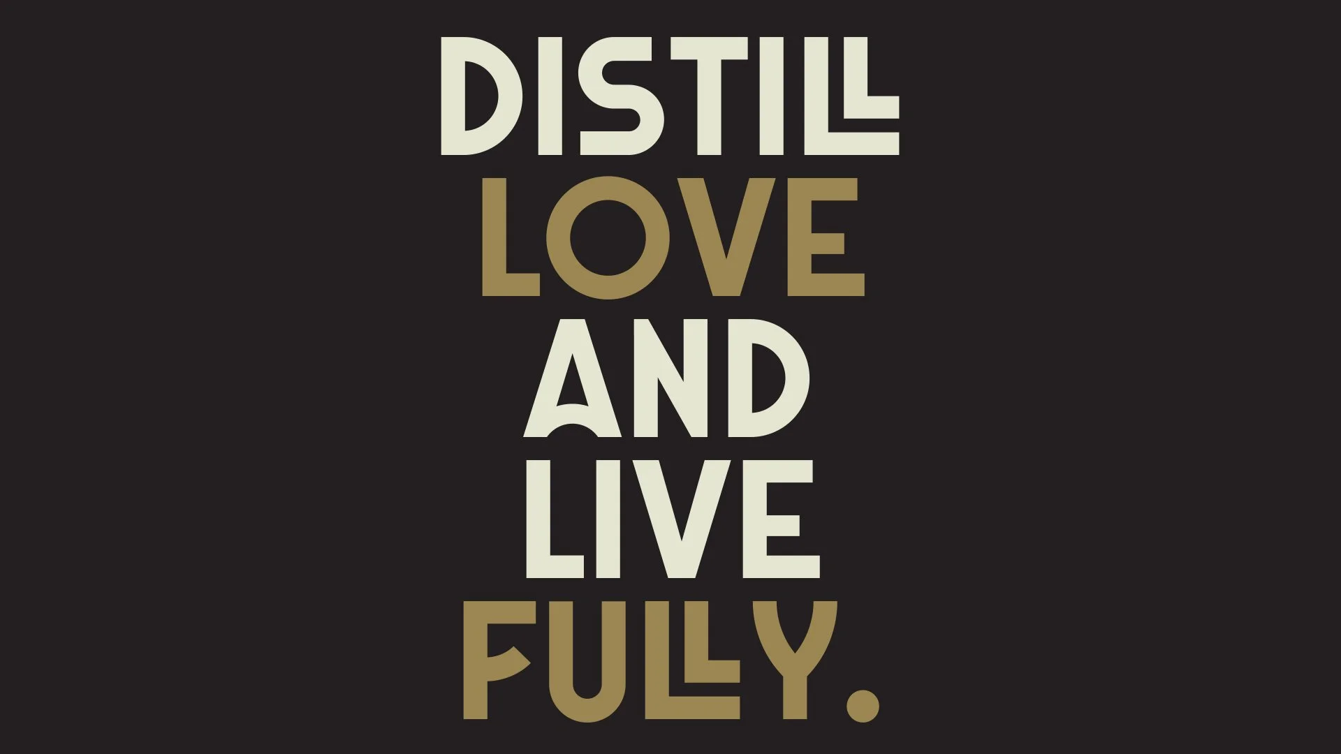
A logo that demands attention
We believe a logo should be a lighthouse. For Neo2, we reimagined the brand identity with a bold, edgy logo that became the magazine’s heartbeat. It was designed to be striking and contemporary, setting a defiant tone for the pages that followed and capturing the avant-garde spirit of the publication from the very first glance.
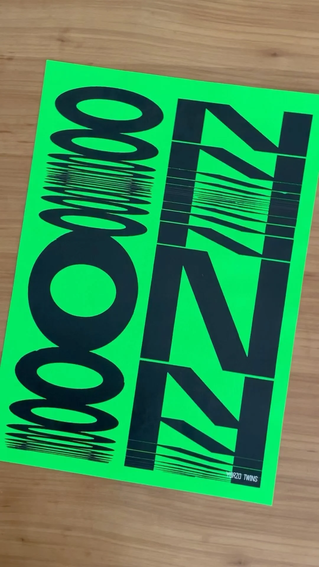
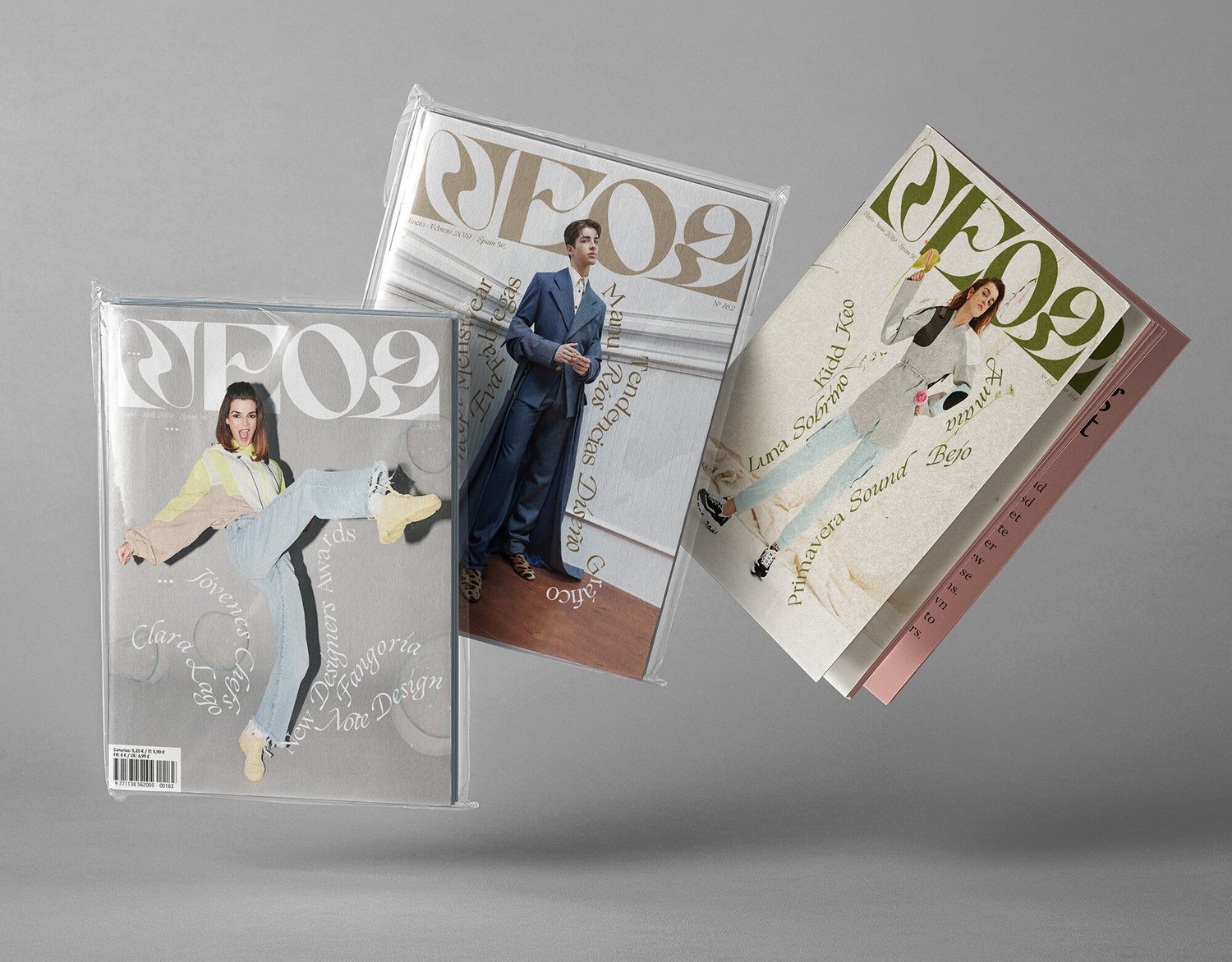
Ditching the grid and playing with type
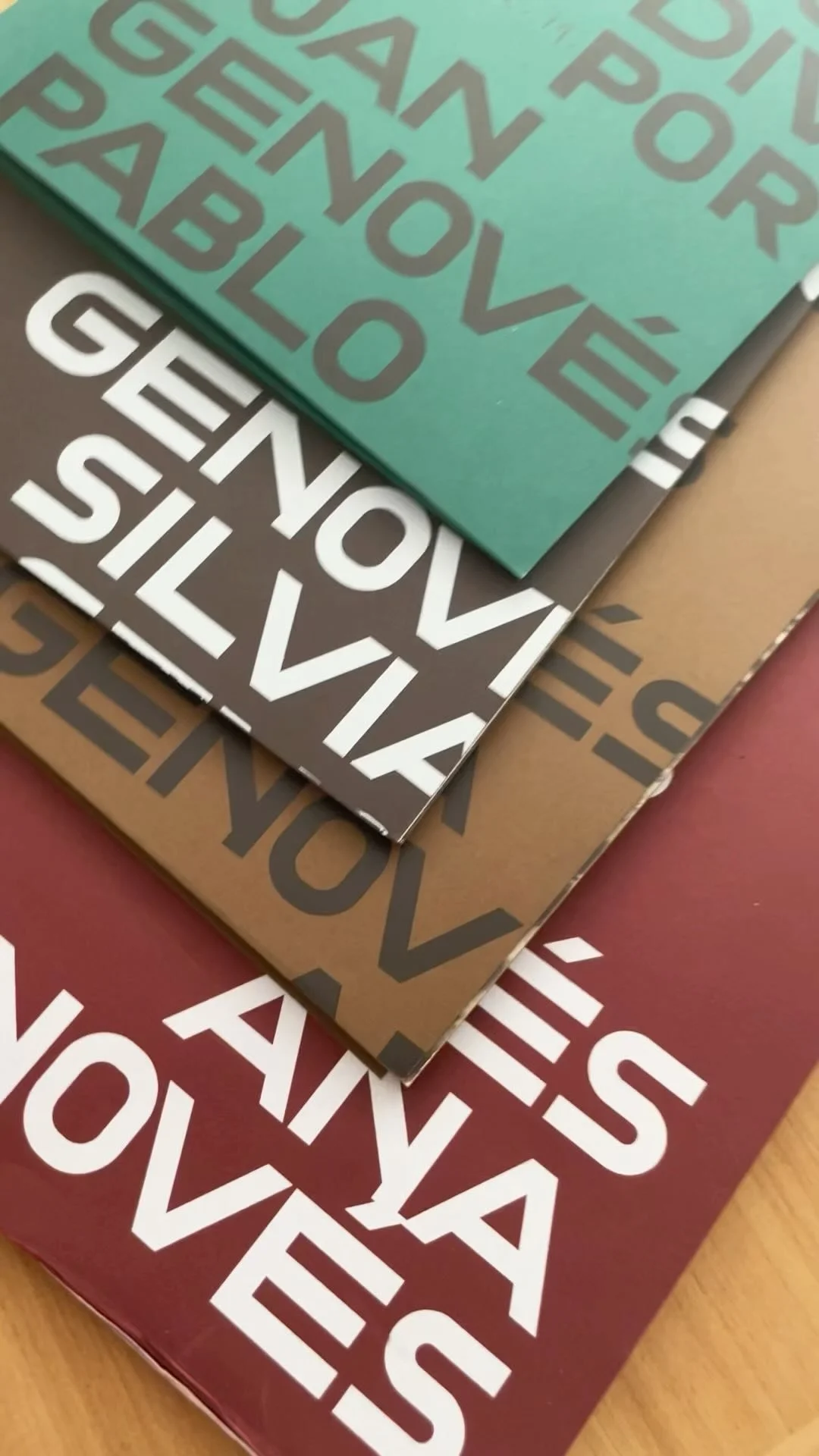
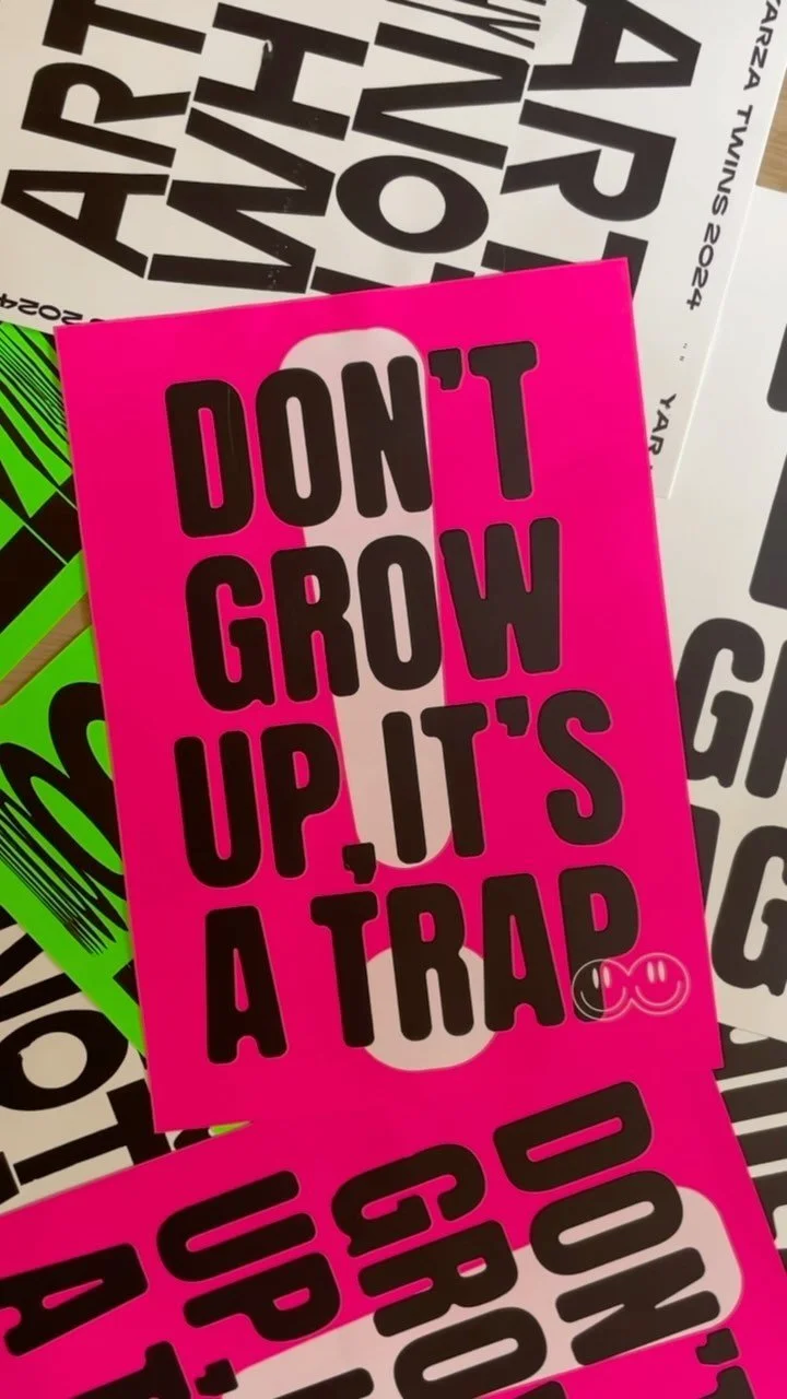
When it came to the editorial design, we threw the rulebook out the window. We intentionally broke away from conventional grids to make every page feel like a surprise. We treated typography like a playground, mixing and matching unexpected styles to create a layout that’s as eclectic and dynamic as the content itself. The result? A visually stimulating experience that keeps you turning pages just to see what happens next.
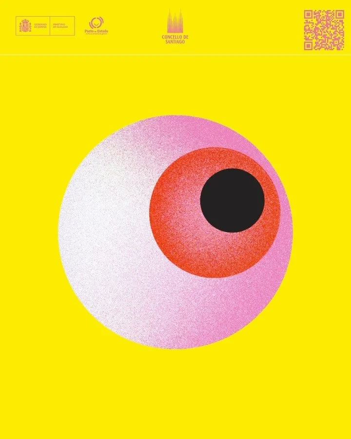
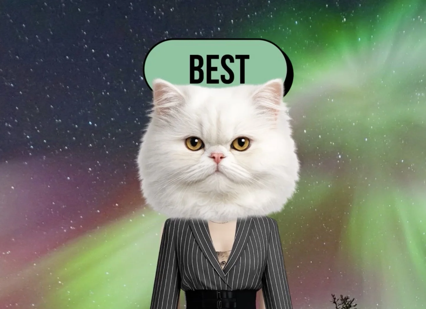
The psychedelic edge: Design that stands out
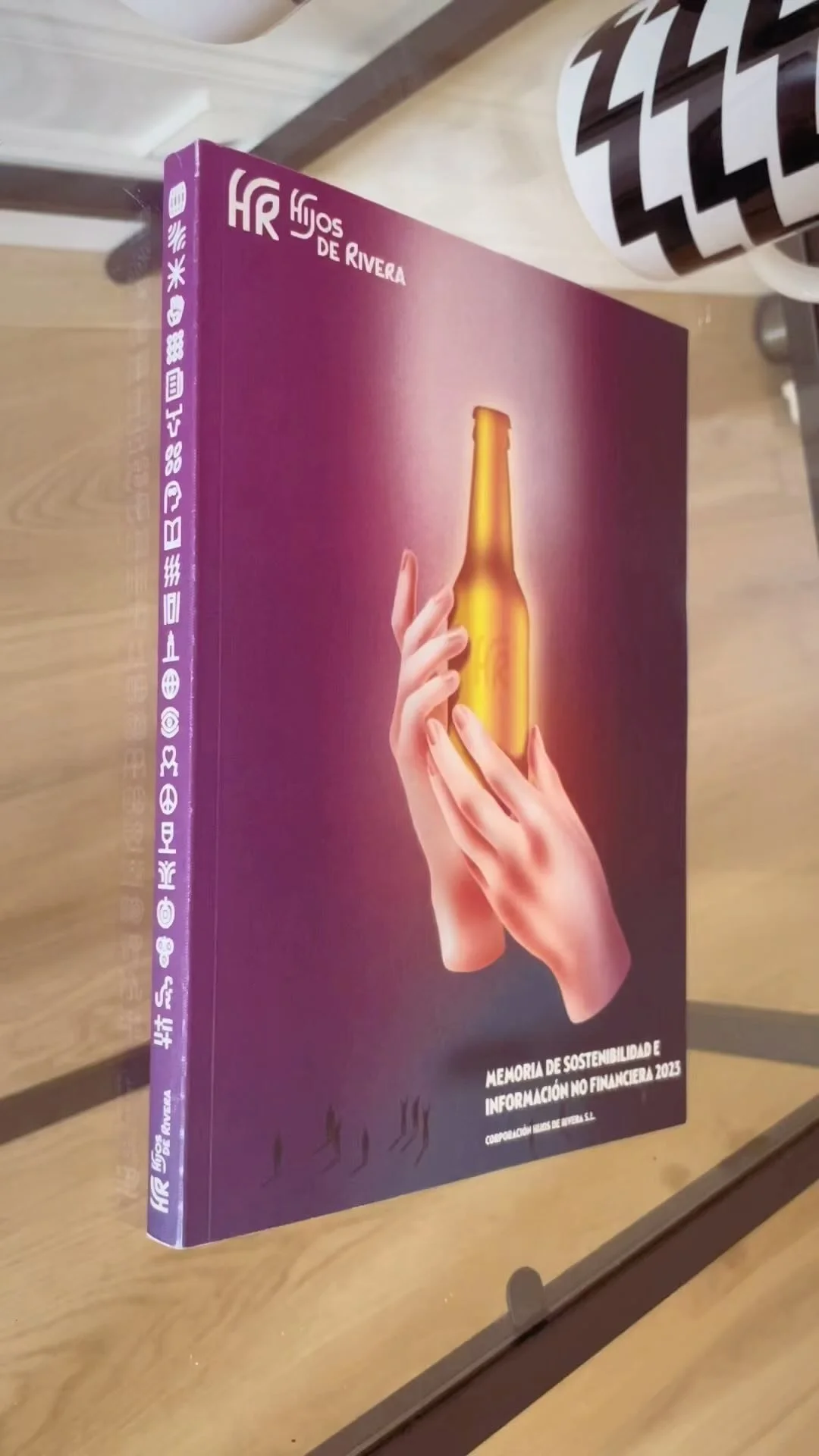
We wanted Neo2 to be unmistakable, even before you opened it. One of our favourite details was the vibrant, psychedelic pattern printed on the magazine's edge. This wasn't just a decorative choice; it was a strategic move to make the magazine pop off any shelf.
This project remains one of our most fulfilling journeys. It taught us that when you challenge the standards of magazine design, you create something that isn't just a publication, it’s a piece of art.
Credits
Creative Direction:
Yarza Twins
Editorial design:
Marta Yarza, Eva Yarza, Rachel Levine
Logo typography:
Yarza Twins
Concept:
Yarza Twins
Typography:
Jacob J. Wise, Lucas Sharp, Connor Davenport, Briefcase Type, Studio Triple, Monotype.
Photography:
Liabuarna, Noah Pharrell, Andrés García Luján, Biel Capllonch, Jeanchristophe Lett, Ojovivo, Javier Callejas, Juan Morata
Services

Not sure where to start?
Most of our clients begin with Branding or Web and expand from there. We’re here to help you figure out exactly what your brand needs to thrive. We pride ourselves on being adaptable, whether you’re a boutique startup or an established name; we offer scalable solutions designed to fit different goals and budgets without ever compromising on aesthetic quality.
FOLLOW US ON INSTAGRAM