Revolutionizing Typeface Design.
Crafting Formula E's Distinctive Font.
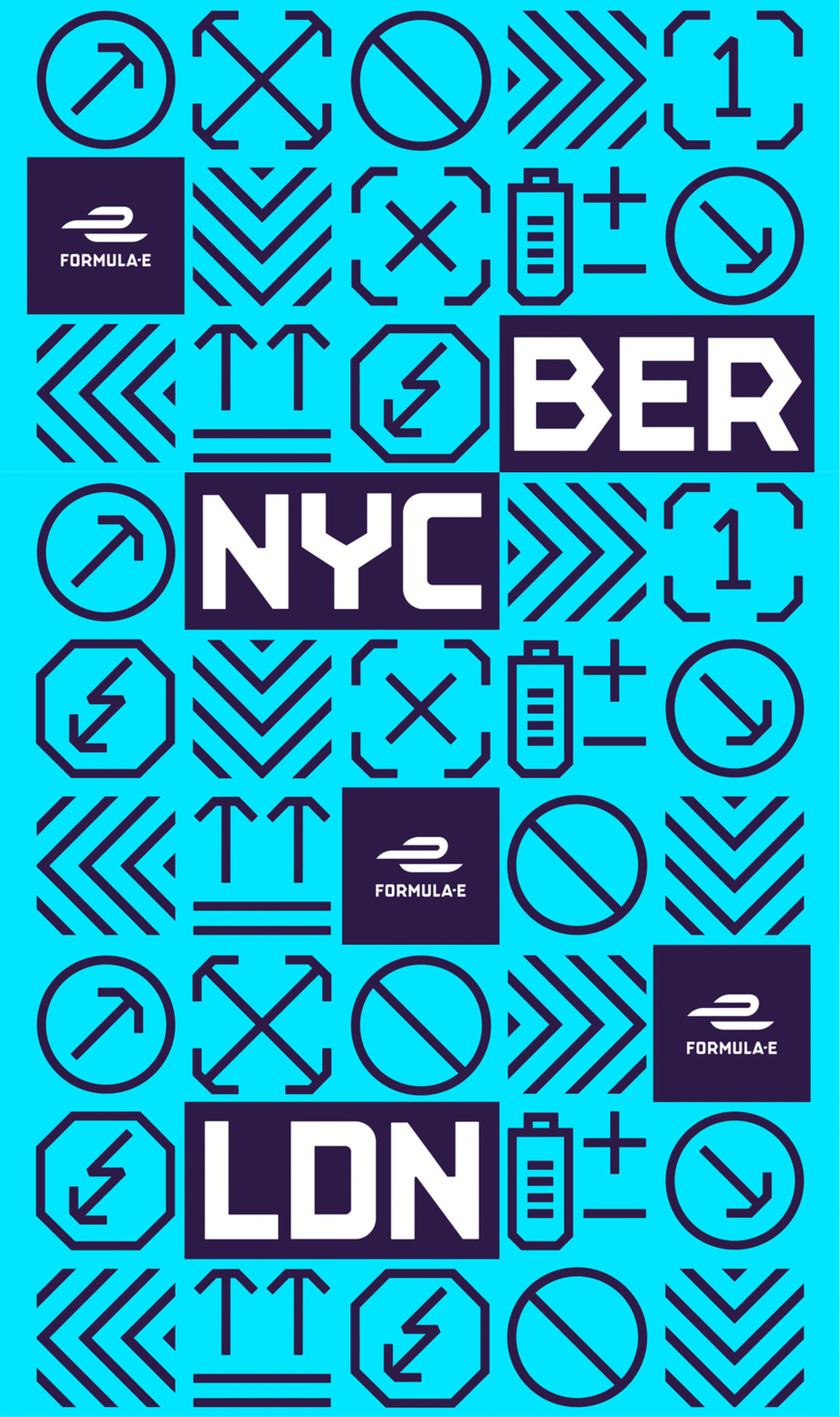
At Yarza Twins, we had the incredible opportunity to create an exclusive typeface for FIA Formula E, the groundbreaking Electric Street Racing Series. Formula E stands at the forefront of motorsport, pushing the boundaries of what sport represents. They blend entertainment, sustainability, technology, and innovation, setting themselves apart from Formula 1 with their commitment to combating climate change and promoting electric vehicles as a solution to urban air pollution.
What sets Formula E apart is their mission to make electric vehicles accessible, breaking down barriers within the EV market. We are immensely proud to support a sport with such a forward-thinking and eco-conscious vision.
The typeface we designed for Formula E not only pays homage to their innovative ethos but also breaks away from the traditional norms of sports branding. Our inspiration came from early 20th-century industrial and maritime fonts, reminiscent of the 1910s to 1930s in the USA and Europe. We drew inspiration from a 1928 travel poster advertising sea voyages between Rotterdam and London by Wm. H. Müller & Co’s Batavier Line. This aesthetic can be found in various posters, ships, and advertising of that era.
Central to this typography is the distinct pointed 'R,' a feature that ignited our creativity to reimagine this style with a modern twist. Formula E, aligned with their pioneering values, aimed to set their brand apart from other sports giants. They envisioned a minimalist and fresh brand with a keen eye on history, and we were honoured to help them bring this vision to life. The brand design was done by Dixon Baxi.
This rebrand was live until 2022.
Credits
Strategy:
Steven Aspinall
Custom typography:
Yarza Twins
Brand leadership:
Ben Padley
Logo design:
Yarza Twins, Rob Clarke
Brand consultancy:
Prophet, Gregg Finlay, Pete Cutler, Ronan Horan
Broadcast graphics:
DixonBaxi
Sound studio partner:
String & Tins
FOLLOW US ON INSTAGRAM
