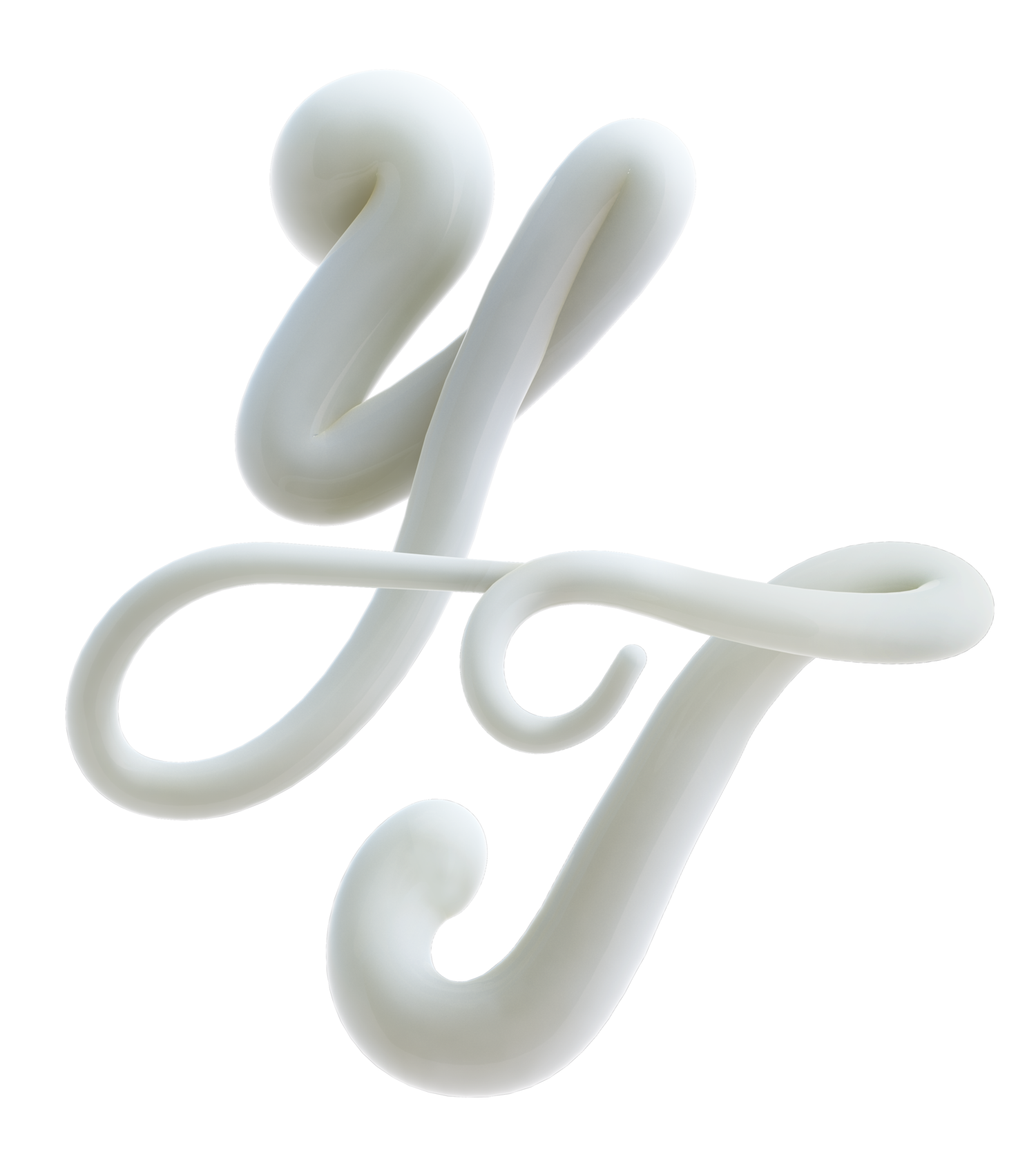
Rebranding Cura, the center of the center of Vigo.
Brand Design, Typography Design, Animation, Logo Design, Merch
Cura is the beating heart of Vigo, Galicia, Spain. Once an old, historic neighbourhood, it has now been completely redeveloped into a vibrant and modern area. Yet, a couple of iconic structures still stand as reminders of its past—the priest's house (Casa do Cura) and the facade of the old nursing home. Inspired by these landmarks, we created a custom display typeface built from geometric shapes, blending the old with the new to reflect the neighbourhood's transformation.
The custom typeface is offered for free with no licence, allowing everyone to use it freely.
Our approach redefines the meaning of Cura. Moving away from its historical association with 'priest' (Barrio do Cura), it embraces a new identity focused on 'healing' (Barrio da Cura). With the slogan "Vigo Cura," the branding highlights renewal and growth. The project included a custom typeface, logo design, colour palette, and a comprehensive brand book. We collaborated closely with Town Visuals for 3D designs and Degrees Studio for the website, with Alegre Roca leading the strategy. Together, we crafted a brand that bridges history and modernity, celebrating the spirit of Cura.
The Cura typeface draws its essence from the architectural heritage of Vigo’s historic neighbourhood. Inspired by the geometric forms of the Casa do Cura and the old nursing home’s facade, it merges tradition with modernity to embody the area’s transformation. Each letter echoes Cura’s journey from past to present, blending history into contemporary design.
The geometric shapes that inspired the Cura typeface extended beyond typography, shaping the visual identity of the neighbourhood itself. These forms were applied to urban elements, transforming everyday objects into design statements. Crosswalks, traffic lights and signage follow this theme, using the same visual language to create a cohesive experience that connects the typeface to the streetscape.


