Rebranding Egypt.
Celebrating Timeless Charm and Vibrant Spirit.
Rebranding Egypt, a country with a rich history, is a big challenge. We took on this task in our design studio with enthusiasm in collaboration with Something More Near. Our goal was to refresh both ancient and modern Egypt, which are full of history, art, and energy.
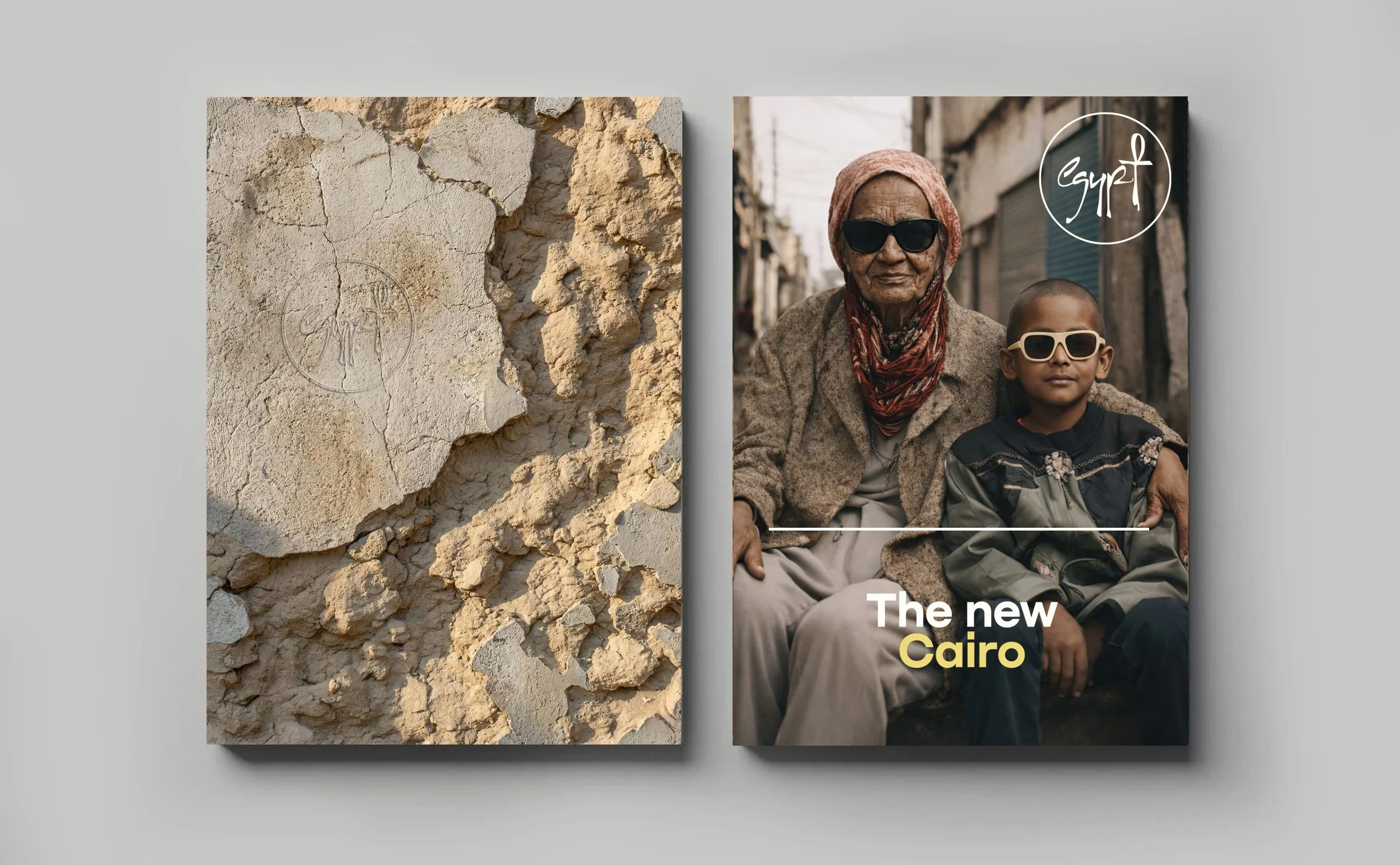
Ancient Egypt, known for its early art, coexists with modern Egypt, a lively place with contemporary music and art.
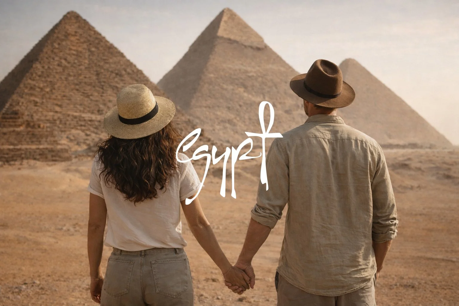
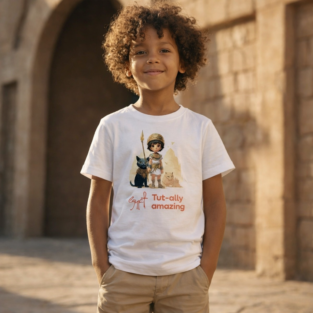
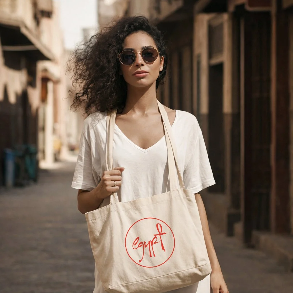
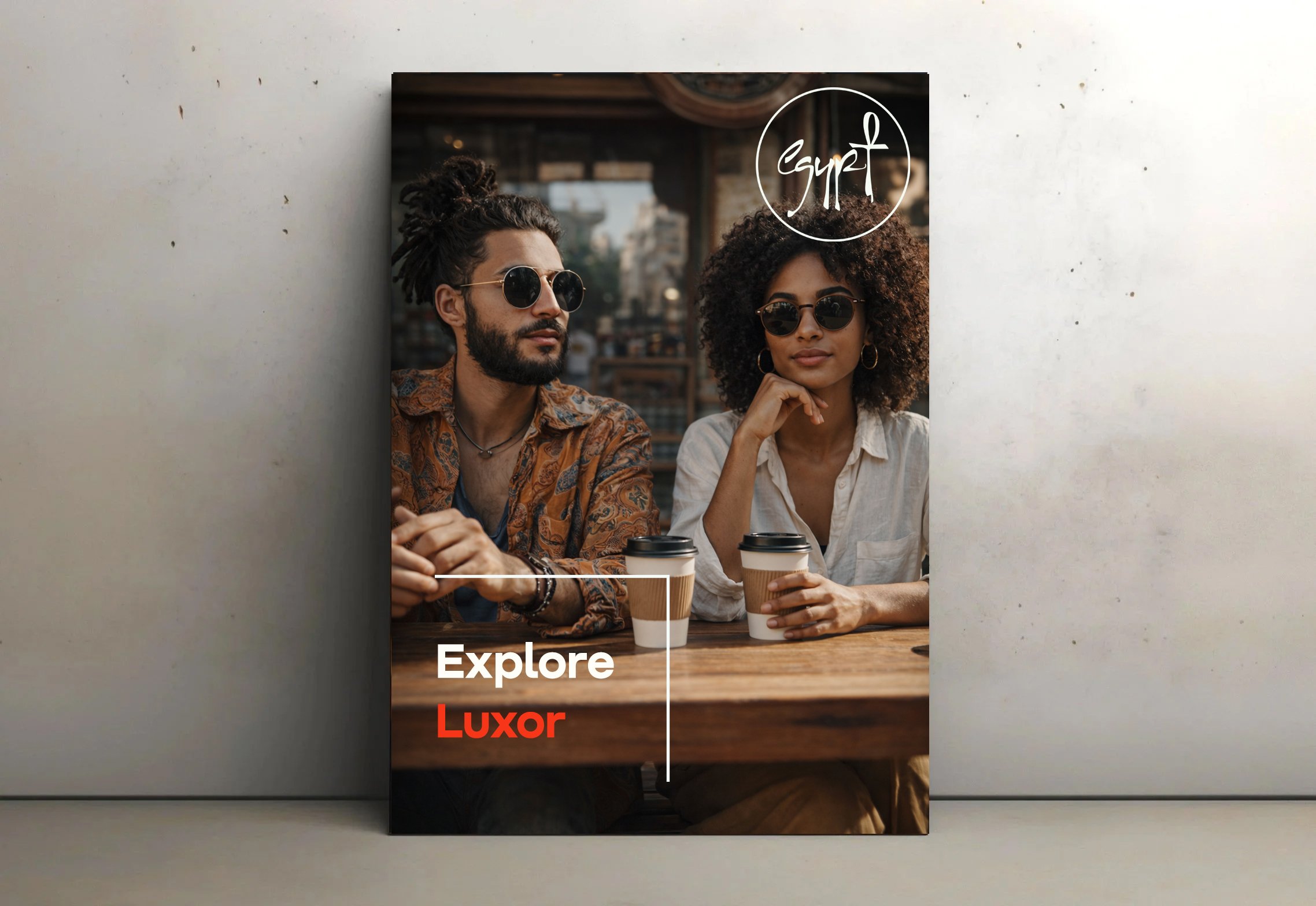
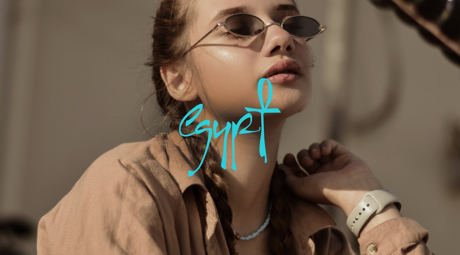
The center of our rebranding effort is a custom font for the logo where a 'T' turns into an ankh, a symbol of Egypt that connects the past and the present. We aimed to improve the existing logo's readability while keeping Egypt's unique character.
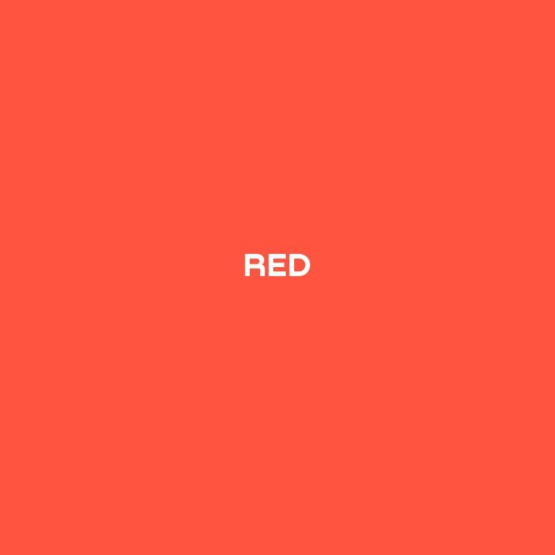
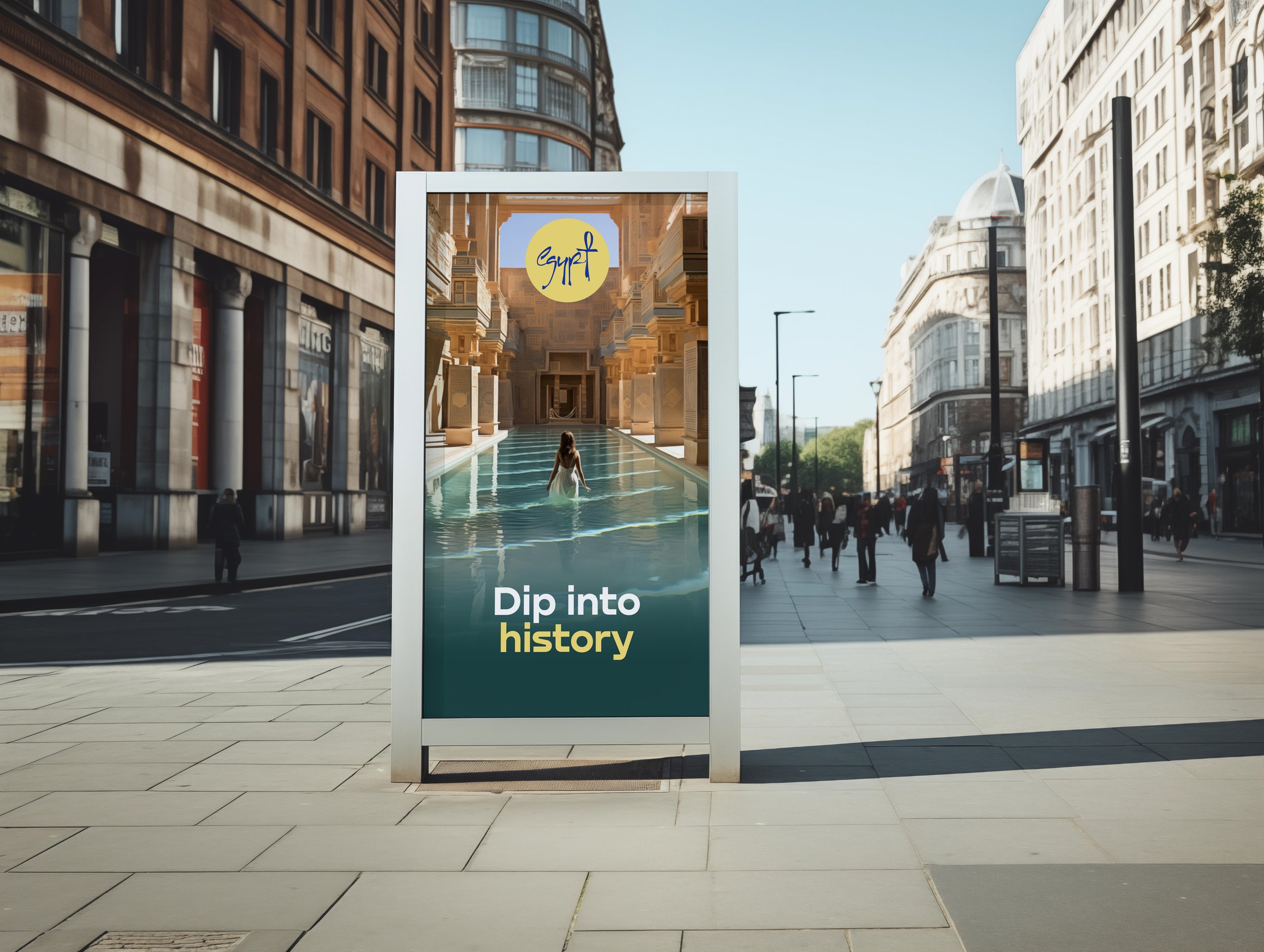
Our colour choices are inspired by Egypt's nature and history.
Our goal was not just to rebrand Egypt but also to celebrate its timeless charm and vibrant spirit.
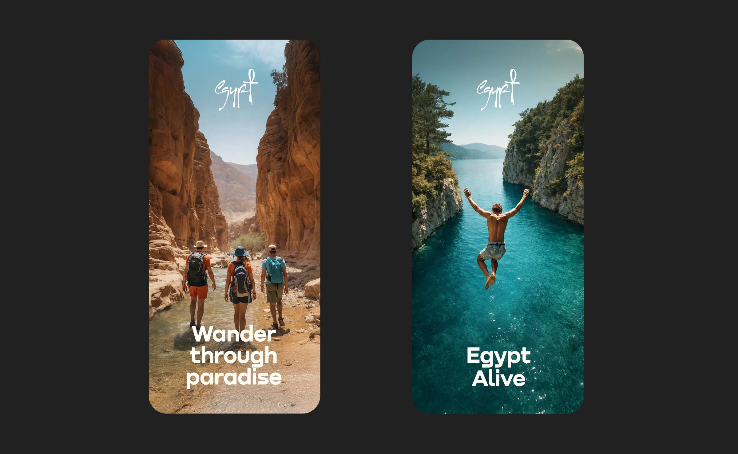


The beautiful sunsets and coral reefs
The first pigment, invented in Egypt thousands of years ago

The gold of the majestic Pharaohs
To reflect the Red Sea


Credits
Design:
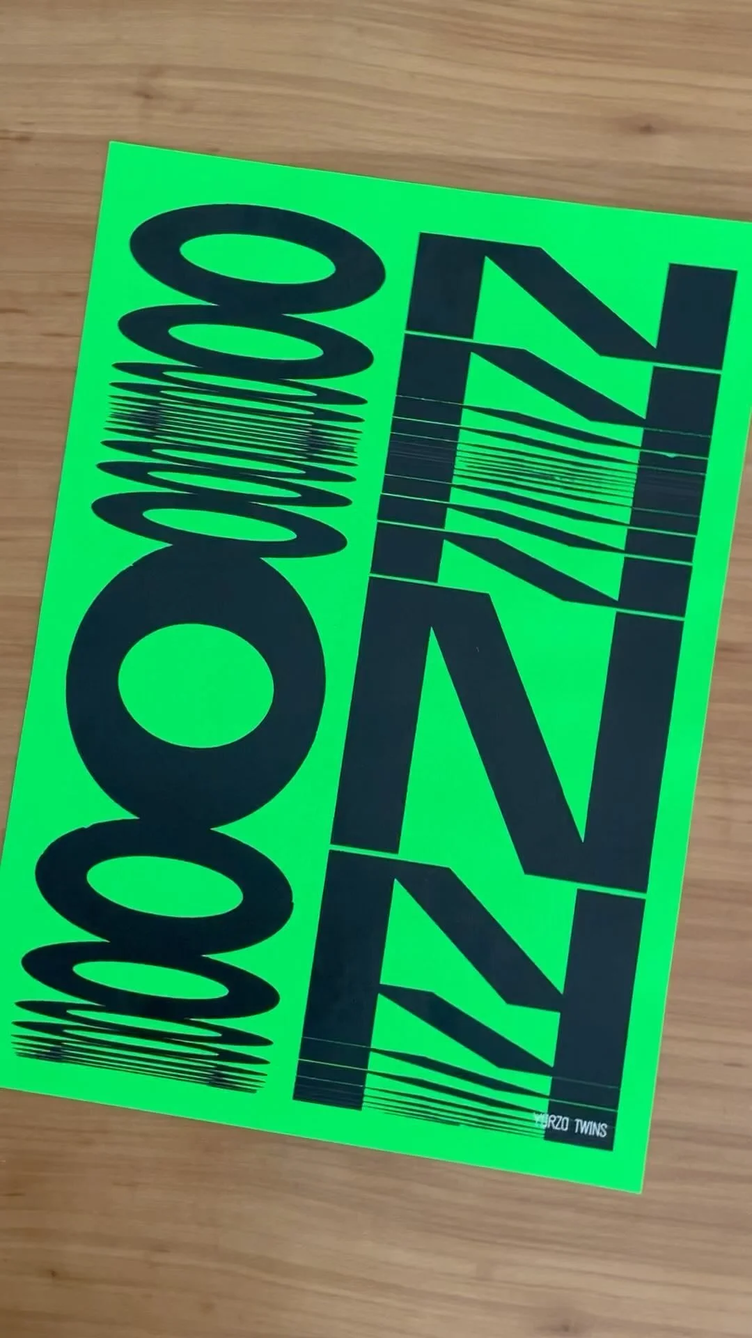
Yarza Twins
Logo typography:
Yarza Twins
Typography:
Denis Serebryakov, Type Today
Strategy:
Something More Near
Production:
Something More Near
Brand voice:
Something More Near
Photography:
Ahmed Hassan, Amina Mahmoud
Web design:
Yarza Twins, Hoda Ali
FOLLOW US ON INSTAGRAM