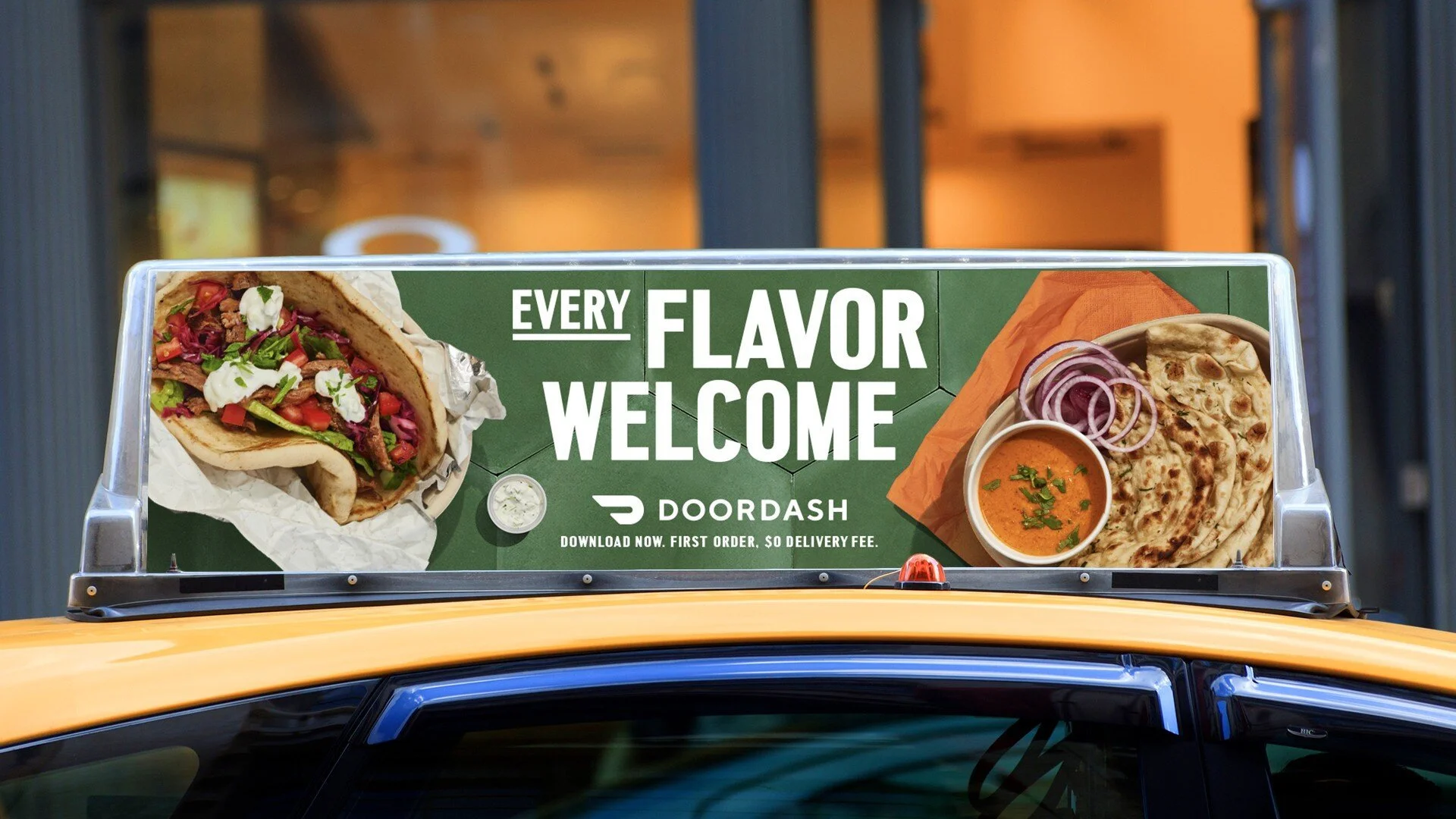
Doordash
Every Favor Welcome
We had the pleasure of joining forces with The Martin Agency to embark on a remarkable journey of redefining the style direction for DoorDash, the San Francisco-based on-demand prepared food delivery service.
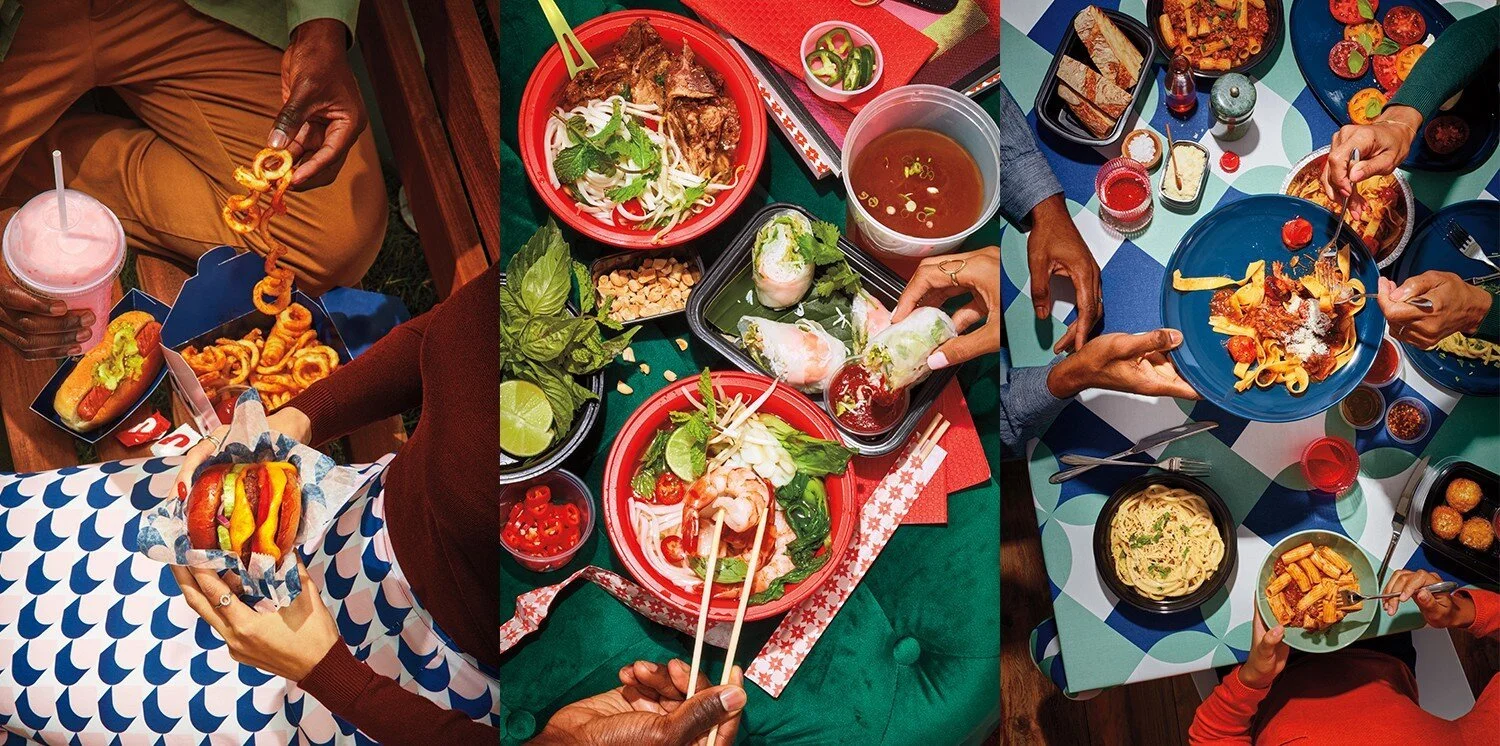
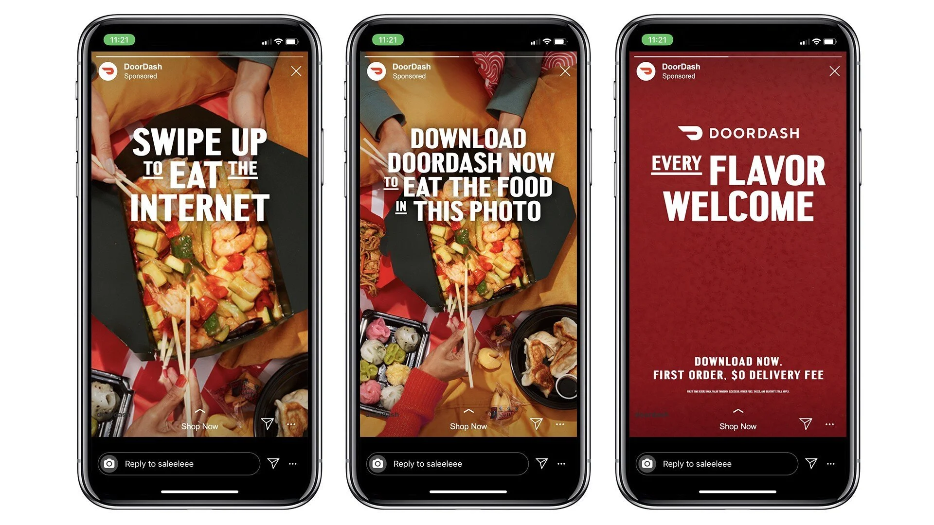
Our partnership with The Martin Agency encompassed a multifaceted approach, involving extensive research and creative direction in the realms of typefaces and photography. Our goal was to lay the visual foundation for a compelling campaign that would resonate with DoorDash's diverse audience.
One of the standout elements of this project was the creation and conceptualization of a series of unique patterns. These patterns were conceived to pay homage to the rich tapestry of cultures that DoorDash serves, encapsulating the essence of global culinary diversity. The letter "D" took centre stage in this creative process, as it was reimagined and transformed into a myriad of shapes and combinations. These patterns not only served as visual storytelling elements but also as a bridge connecting DoorDash to the diverse array of culinary experiences it offers.
Our collaborative efforts yielded a style evolution that breathed fresh life into DoorDash's visual identity. Join us in exploring how this project set the stage for a more vibrant, inclusive, and culturally diverse DoorDash, where the art of branding converged with the world's diverse culinary traditions.


FOLLOW US ON INSTAGRAM